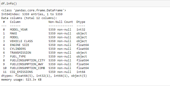
1. Analysis and Visualization of Fuel Consumption
Against CO 2 Emission Shakir Adeyemi Adeyemi Tewogbade an open source and it was collected from Fuel consumption ratings -Open Government Portal (canada.ca). Open data has consent for re-use and let researchers build on existing studies (Brandon and Weber, 2022). Our dataset includes the following variables: vehicle make, vehicle model, vehicle model year, make of vehicle, size of vehicle engine, transmission, cylinder, type of fuel, fuel consumed during movement in the city, fuel consumed in the highway, and emission values.
For appropriate visualization, we have selected Python libraries like Num Py (computation of numerical values), pandas (loading and manipulating data), matplotlib (handling plots) and seaborn to carry out our analysis in Jupyter Notebook. Various types of graphs like line graph, bar chart, heat maps were plotted to answer the questions formulated from our dataset.
It is important to use correct visualization techniques in data analysis (Xi and Xinyu, 2021). Visualization technique selected for data analysis will be good if it is efficient, suitable and expressive (Mackinlay, 1986. Schumann and Muller, 2000). Our visual analysis is being carried out on Jupyter notebook platform. Jupyter notebook allow us to create and share files which include texts, live codes and visualizations. Abstract-CO2 emission has an adverse effect on the environment and cause greenhouse effect with significant negative climatic changes. This subsequently lead global warming which hurts both human and crops. It is important for us to perform visual analysis with available dataset using Canada as a case study.
2. II. Background
Author: e-mail: [email protected]
Jupyter is interactive and web-based platform where computational activities can be executed with visualization. With the notebook, users can view their codes outcomes in-line independent of other segment of the project work. Each cell containing lines of codes are seen with their corresponding outputs. To use Jupyter notebook for our study, we divided the process into four stages:
3. c) Bar Chart
Also known as column chart. It is used to display categorical data either vertically or horizontally where value of each category is represented by corresponding bar. Bar chart is readily modifiable most times with colours to capture significance differences. These are seen in stacked bar chart and clustered bar chart.
4. d) Box Plot
Box plots show extreme values, median and quartiles. While the plot is gotten from the interquartile range (length of the box) and median, the whisker moves the box to the minimum and maximum values without including the outliers.
5. e) Heat Map
It is used to display relationship between columns as represented in matrix view mode. Visualization analysis is achieved through selection of appropriate coloring. Heat map is an excellent plot in displaying variance through many variables while patterns are formed.
6. IV. Analysis
Data are raw fact based on occurrences in human daily life and its environment. One of the means of turning data into comprehensible information and knowledge is through visualization (Narra and Yashaswini, 2020). When there is huge amount of data, there will be difficulty in understanding facts in it. With existence of data visualization techniques, visual illustrations that reveal hidden insights can be readily created. Thus, this study will be answering the questions that do with fuel combustion and C02 emission considering different models of cars in Canada.
1. C02 trend in the years of study 2. What fuel type caused most emission? 3. What make of car produced most C02 emission during the period of study? 4. Which vehicle class considering fuel consumption produced most C02 emission ?
7. a) Data Collection
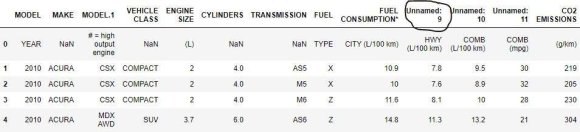
The first step was to import the needed data in .csv file format to our working environment using Panda library.
8. Analysis and Visualization of Fuel Consumption Against Co2 Emission
9. Global Journal of Science Frontier Research ( H ) XXIII Issue VI Version I Year 2023
10. © 2023 Global Journals
Jupyter notebook exist in document format with three segments which are cells for marking down, cells for coding and result parts (Park and Sekerinski, 2018). The architectural design of Jupyter notebook is based on JavaScript browser which interacts with HTTP server through WebSocket. The webserver utilize tornado embedded in Python to relate incoming message to the kernel. kernel that provides appropriate outputs after processing of the messages and these are communicated through notebook web interface. The kernel is the core actor in carrying out execution of codes in the Notebook. In this work, our target is to write codes that import fuel consumption dataset in.csv, clean it, prepare it and perform visual analysis. As stated earlier our graphs and plots are achieved with aid of libraries with Python Jupyter with appropriate codes. Important graphs and plots that put answers to the questions posed by our fuel consumption dataset are:
11. a) Line Graphs
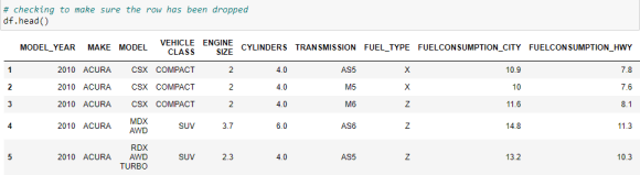
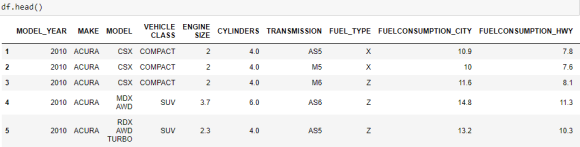
Widely used visualization technique where independent variables and dependent variables are projected on X and Y axis. Various data points are joined to show appropriate line produced by selected The dataset imported was viewed using syntax df.head () to display the first five rows for our perusal. We checked our dataset after all the cleaning to be sure that it is reading for visualization.
12. III. Main Part
13. Analysis and Visualization of Fuel Consumption Against Co2 Emission
14. Global Journal of Science Frontier Research ( H ) XXIII Issue VI Version I Year 2023
15. Analysis and Visualization of Fuel Consumption Against Co2 Emission
16. Global Journal of Science Frontier Research ( H ) XXIII Issue VI Version I Year 2023 d) Data Analysis
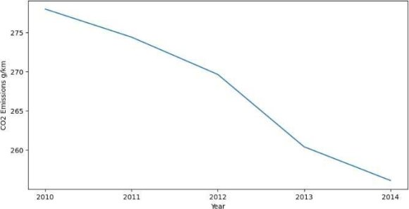
The first set of plots with our dataset is to show trend in C02 emission from 2010 to 2014. The plot shows downward trend which support various governmental policies in reducing emission and greenhouse effect. The next visual analysis is setting up heat map to show interaction between our dataset attributes.
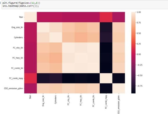
17. Figure 13: Heatmap Showing Correlation Among Variables
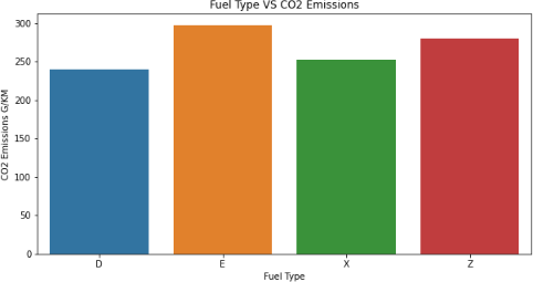
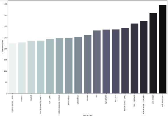
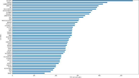
It was observed from the heat map that there is high positive correlation between fuel consumptions, engine size and cylinders with C02. Thus, we extend our visualization to plotting of fuel types with C02. Moving forward, we produced another visual that display which of the vehicle make produced most emission. The graph (Fig. 16) shows that Bugatti lead in term of amount of C02 emission produced into the environment. Bugatti uses fuel type Z with more controlling impact CO2 emission as shown in Fig. 14 above. As identified by our heat map, interaction between engine size C02 emission is plotted using scatter plot through seaborn. From the display, there is a strong direct proportional relationship between the two variables. The bigger the engine size the higher the C02 emission.
18. Analysis and Visualization of Fuel Consumption Against Co2 Emission
19. Global Journal of Science Frontier Research ( H ) XXIII Issue VI Version I Year 2023
20. Analysis and Visualization of Fuel Consumption Against Co2 Emission
21. Global Journal of Science Frontier Research ( H ) XXIII Issue VI Version I
Analysis performed on the dataset will validate emission models as generated by the various attributes. The dataset contains 5359 records with 12 attributes and as such it is hard to see information the raw figures is speaking to. Representing the data on various visual plots allow us to see hidden information at ease. Ben and Rachel 2015, used applicable visualization techniques like column chart, pie chart, line plot to analyze fuel consumption data. Similarly, Bielaczyc, Szczotka and Woodburn 2019 used column chart to represent fuel type plot against C02 emission and contour map to display emission in certain locations with vehicle load and speed.
22. Analysis and Visualization of Fuel Consumption Against Co2 Emission
23. Global Journal of Science Research ( H ) XXIII Issue VI Version I Year 2023
24. 59
© 2023 Global Journals
25. V. Discussion
The application of bar charts (Fig. 15 &16) in our analysis has easily been achieved because of its robustness in representing categorical data, perhaps Cleveland's dot plot would have taken fewer spaces with improved aesthetic for plot like fuel type vs C02 emission. For simplicity each dot will be represented as 40 g/km of emission. Dot plot uses minimum ink to optimum effect and still deliver excellent design (Tufte, 1983. Dave, Jaap and Ian, 2005).
Heat map has been widely used in many visualizations analysis due to its intuitive approach of colouring and ability to present interaction among variables in a single diagram. In work such as ours, we could have introduced our heat map after plotting table lens graphs. As asserted by Sinar 2015, table lens has a very high efficiency in yielding many interactions in a single plot while serving as starter in dataset visualization. Also, in addition to our heatmap, facet (Trellis) plots can be used to create additional interactions (sub-plots) for variables showing strong correlation from the map.
26. VI. Conclusion
Data visualization has gained great popularity with advancement of software technology and variety of platforms. One of the popular platforms to create visualization is Jupyter notebook where cells for codes and visual displays are available on the interface. We have used data visualization to investigate controlling effects of fuel consumption on C02 emission. Variety of techniques such as line chart, bar chart, heat maps and scatter plot were used to analyze the field data in order to create informative patterns on level of influence of various variables on C02 emission. Our visual analysis revealed resultant effects of important variables that need to be curtailed to minimize C02 emission in the environment. This kind of study will assist policy makers to find effective solutions to climatic changes caused by vehicle movements.
In as much as we have efficient visuals which produced graphical display of raw data., there are few exceptions. The exceptions were critically reviewed to create room for improvement. The improvement will yield visual that create more robust outcomes where concentrated interactions are revealed in our visuals and nicer aesthetic.
27. References Références Referencias


| dataset. Line graphs show quick glance of upward |
| movement (direct proportional) and downward |
| movement (inverse proportional). |
| b) Scatter Plot |
| 1. Launch the platform |
| 2. Load dataset |
| 3. Clean & process the data |
| 4. Analysis and Visualization |
| To load, clean, process and analyze data, |
| important libraries are used with Python Jupyter such as |
| 1. Panda-loading, reshaping, merging, slicing, sorting |
| and aggregation of data through its special data |
| structure and operations. With Python, panda |
| perform efficiently with data structures (Rupal and |
| Khushboo, 2022) |
| 2. NumPy-It is used for mathematical and numerical |
| computation on python coding environment with |
| capabilities for quick array processing |
| 3. Matplotlib-a low-level library used for plotting graphs |
| and it is a great alternative to MATLAB |
| 4. Seaborn-was developed by Michael Waskom in |
| 2012 to handle statistical plots. It is a high-level |
| source unlike matplotlib with an improvement in |
| terms of aesthetics and readability. With seaborn, |
| line of codes for making plots will be fewer compare |
| to matplotlib. |
| NEDC and WLTC-an overview and experimental results from market representative vehicles. IOP conference series: Earth and Environmental Science 214 012136. doi:10.1088/1755-1315/214/1/012136 3. Bishop, J., Martin W., and Boies, A. (2014). Cost effectiveness of alternative power-trains for reduced energy use and CO2 emissions in passenger vehicles. Appl Energy 2014: 124, 14 -61. 4. Brandon, L., and Nick, W. (2022). Ethics of open data. arXiv: 2205. https://doi.org/10.48550/arXiv.22 05.10402: [accessed on 19 November 2022]. 5. Carvalheira, P. (2018). A Model for the calculations of CO2 emissions and fuel consumption of a diesel engine driven car in the WEDC. Proceedings of the 1 st Iberic Conference on Theoretical and Experimental Mechanics and Materials. 11 th National Congress on Experimental Mechanics. ISBN: 978-989-20-8771-9 6. Dave, K., Jaap, J., and Ian, W. (2005). Designing Science graphs for data analysis and presentation. The bad, the good and the better. Science & Technical Publishing Department of Conservation Wellington, New Zealand. 7. Analysis |
| 1. Ben, S., and Rachel, M. (2015). Literature review: |
| Real-world fuel consumption of heavy-duty vehicles |
| in the United States, China and European Union. |
| The International Council on clean transportation. |
| White paper. |
| 2. Belaczyc, P., Szczotka, A., and Woodburn, J. |
| (2019). Carbon dioxide emissions and fuel |
| consumption from passenger cars tested over the |
Journal of Science Frontier Research ( H ) XXIII Issue VI Version IYear 2023